Planning and Insights
The Planning and Insights dashboard provides comprehensive analytics for cyclist and mobility usage. This guide focuses on how to effectively use the filtering capabilities to analyze your data.
Filtering Capabilities
There are two primary methods for filtering your data: (1) the filter panel and (2) direct interaction with visualizations.
When filtering with the left filter panel, scroll down to click the apply button.
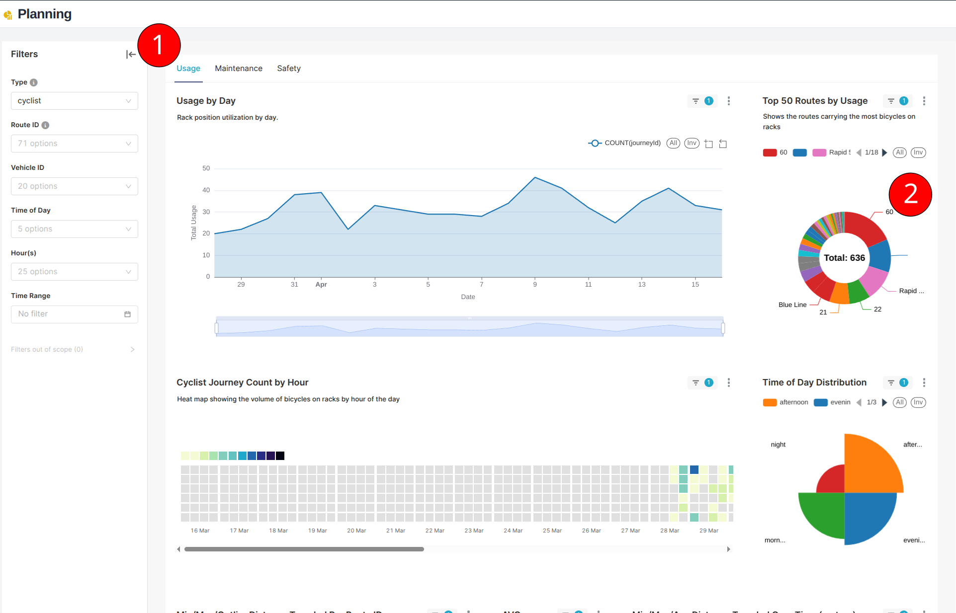
1. Filter Panel
Access the filter panel by clicking the arrow on the left side of the dashboard. This panel provides comprehensive filtering options:
Available Filters
-
Data Type
- Cyclist usage
- Mobility usage
-
Route Information
- Filter by specific route IDs
- View data for selected routes only
-
Vehicle Selection
- Filter by specific vehicle IDs
- Track individual vehicle data
-
Time Filters
- Time of day segments
- Specific hours
- Custom date ranges
2. Interactive Visualization Filtering
The dashboard supports direct interaction with charts and graphs for quick filtering:
-
Pie Charts
- Click on segments to filter by that category
- Filter by route distribution
- Filter by time of day
-
Bar Graphs
- Select specific bars to filter data
- Click on legend items to toggle categories
- Multi-select available for comparison
Tips
- Hover over chart elements for detailed information
- Use multiple filters to drill down into specific scenarios
- Clear filters to return to the full dataset view
- Pay attention to filter indicators to track active filters
Note
For detailed information about specific graphs and metrics, please refer to the individual graph descriptions within the dashboard. This guide focuses solely on filtering capabilities and data interaction.